Foundation Framework for Web Sites Production
The Foundation framework is
something I discovered by accident browsing through some github project
pages. I really liked how one of the sites looked on my iPad. I was also
pleased to see how HTML crafted, using clear names for classes and HTML5
semantics. As it turned out, that site was using Foundation Framework by
Zurb - design agency in San Francisco Bay
area.
I checked out the
documentation and Foundation
appears to be pretty solid framework for web applications prototyping and
production. It contained everything needed:
Grid Layouts,
Buttons,
Forms and
UI. And of cause, all
of that is open source hosted on github.
During my preparation of project page for
candidate I decided
to try it out. I was really happy of the experience.
Object Oriented CSS
Have you heard of
OOCSS? Initially I
thought that idea is almost non-sense, but I’m changing my opinion now. I
think Foundation fully conforms to OOCSS style of development - each
behavior or UI you want to apply to HTML element is done by applying of
corresponding class.
Great thing is that you see how it’s done in framework and do same in your
code as well. I remember the times I started to do HTML/CSS and I higly used
#id’s, applying the styles by element Id. The code was awful and styles
applied on #id’s were not re-usable at all, so if I needed the same
margin/padding or text color I have to copy the section of CSS and move it
into next #some-id { ... }.
With OOCSS you rely on classed. Here some example,
<div class="container darker-grey light-border small-padding">
 <div class="row smaller-fonts">
  <div class="four columns"></div>
  <div class="four columns"></div>
  <div class="four columns"></div>
 </div>
</div>
Look, no #id’s - classes only. With classes I control: position, colors,
borders and margin/paddings. This is really cool, since all of that classes
are easy reusable in any part of page.
Grid system
Grid systems is really cool concept and allows to develop much faster.
Instead of writing own CSS that would position elements, you stick to Grid
System. The classical grid system is probably
960.gs. It’s really great and blown my mind as
I first time tried it, but currently it little outdated: 960px wide is small
for modern monitor and it is not adaptive. Modern web design demands site
looks great both on PC and Mobile devices, adapt it’s content based on
screen size.
Here is a quote of Foundation documentation.
The grid is built around three key elements: containers, rows, and columns.
Containers create base padding for the page; rows create a max-width and
contain the columns; and columns create the final structure. Everything on
your page that you don’t give a specific structural style to should be
within a container, row and column.
You develop the layout based on planned number of row and columns that
compose the row. Again, code is done in OOCSS way with clean classes names,
so you write almost “plain” English in HTML.
<div class="container">
  <div class="row">
    <div class="eight columns">
      Eight columns
    </div>
    <div class="four columns">
      Four columns
    </div>
  </div>
</div>
After design is ready, you just open it on iPad and.. Surprise, it looks
great there! Text and columns are adaptively fits the screen size.
Buttons and Forms
Buttons and Forms are same important as Colors and Fonts in your web site.
You can’t get good site appearance if buttons and forms are ugly. I usually
spend a lot of time on “beautifying” those, but still unhappy with results
at the end of the day. With Foundation it’s easier. You got nice styles from
the box.
Forms:
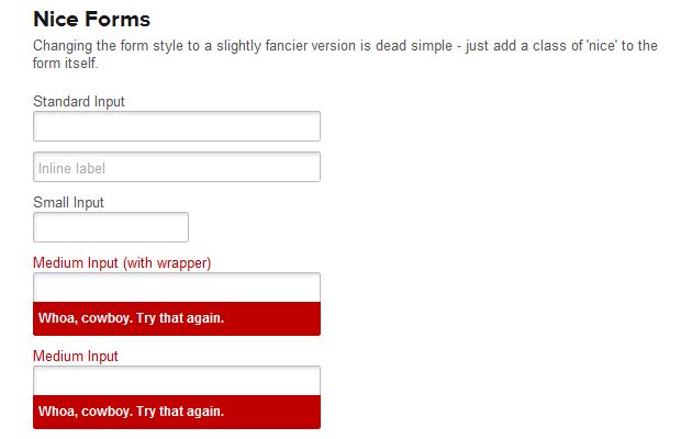
Buttons:
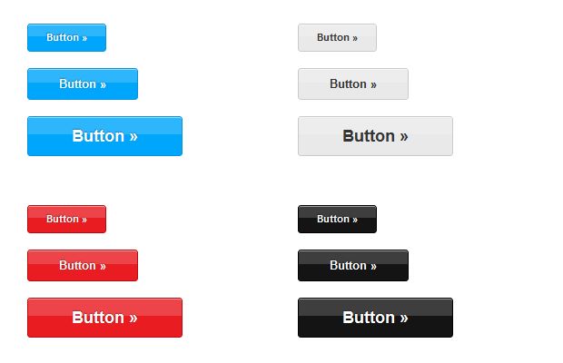
Recently, I’ve
submitted green
button style, so I hope it will be available soon.
UI stuff
Besides those primary things you got nice bonus. That’s different UI
elements commonly used through different web sites. It includes: Alerts,
Labels, Warnings, Tooltips, Tabs etc.
For candidate site I
successfully used Pagination UI element.
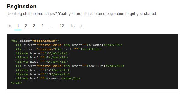
Conclusions
Currently Bootstrap from
Twitter is obvious leader in that niche. But I really think Foundation will
get it’s place. Easy to use, great documentation
repository is very active,
so we might expected further great features in Foundation.
And by the way.. To payback Foundation, I got idea for small product:
inspired by Bootswatch I’m about to
create bunch of “ready-to-use” Foundation themes, that you just download and
start to use immediately. It will work great for people who are about to
create one page product presentation or simple blog. Hope it will go fine
and I release it soon.
The Foundation framework is
something I discovered by accident browsing through some github project
pages. I really liked how one of the sites looked on my iPad. I was also
pleased to see how HTML crafted, using clear names for classes and HTML5
semantics. As it turned out, that site was using Foundation Framework by
Zurb - design agency in San Francisco Bay
area.
I checked out the
documentation and Foundation
appears to be pretty solid framework for web applications prototyping and
production. It contained everything needed:
Grid Layouts,
Buttons,
Forms and
UI. And of cause, all
of that is open source hosted on github.
During my preparation of project page for
candidate I decided
to try it out. I was really happy of the experience.
Object Oriented CSS
Have you heard of
OOCSS? Initially I
thought that idea is almost non-sense, but I’m changing my opinion now. I
think Foundation fully conforms to OOCSS style of development - each
behavior or UI you want to apply to HTML element is done by applying of
corresponding class.
Great thing is that you see how it’s done in framework and do same in your
code as well. I remember the times I started to do HTML/CSS and I higly used
#id’s, applying the styles by element Id. The code was awful and styles
applied on #id’s were not re-usable at all, so if I needed the same
margin/padding or text color I have to copy the section of CSS and move it
into next #some-id { ... }.
With OOCSS you rely on classed. Here some example,
<div class="container darker-grey light-border small-padding"> <div class="row smaller-fonts"> <div class="four columns"></div> <div class="four columns"></div> <div class="four columns"></div> </div> </div>
Look, no #id’s - classes only. With classes I control: position, colors,
borders and margin/paddings. This is really cool, since all of that classes
are easy reusable in any part of page.
Grid system
Grid systems is really cool concept and allows to develop much faster.
Instead of writing own CSS that would position elements, you stick to Grid
System. The classical grid system is probably
960.gs. It’s really great and blown my mind as
I first time tried it, but currently it little outdated: 960px wide is small
for modern monitor and it is not adaptive. Modern web design demands site
looks great both on PC and Mobile devices, adapt it’s content based on
screen size.
Here is a quote of Foundation documentation.
The grid is built around three key elements: containers, rows, and columns. Containers create base padding for the page; rows create a max-width and contain the columns; and columns create the final structure. Everything on your page that you don’t give a specific structural style to should be within a container, row and column.
You develop the layout based on planned number of row and columns that
compose the row. Again, code is done in OOCSS way with clean classes names,
so you write almost “plain” English in HTML.
<div class="container">
<div class="row">
<div class="eight columns">
Eight columns
</div>
<div class="four columns">
Four columns
</div>
</div>
</div>
After design is ready, you just open it on iPad and.. Surprise, it looks
great there! Text and columns are adaptively fits the screen size.
Buttons and Forms
Buttons and Forms are same important as Colors and Fonts in your web site.
You can’t get good site appearance if buttons and forms are ugly. I usually
spend a lot of time on “beautifying” those, but still unhappy with results
at the end of the day. With Foundation it’s easier. You got nice styles from
the box.
Forms:

Buttons:

Recently, I’ve
submitted green
button style, so I hope it will be available soon.
UI stuff
Besides those primary things you got nice bonus. That’s different UI
elements commonly used through different web sites. It includes: Alerts,
Labels, Warnings, Tooltips, Tabs etc.
For candidate site I
successfully used Pagination UI element.

Conclusions
Currently Bootstrap from
Twitter is obvious leader in that niche. But I really think Foundation will
get it’s place. Easy to use, great documentation
repository is very active,
so we might expected further great features in Foundation.
And by the way.. To payback Foundation, I got idea for small product:
inspired by Bootswatch I’m about to
create bunch of “ready-to-use” Foundation themes, that you just download and
start to use immediately. It will work great for people who are about to
create one page product presentation or simple blog. Hope it will go fine
and I release it soon.